Content pages
If you select content from the content list or file tree, this will take you to the desired content.
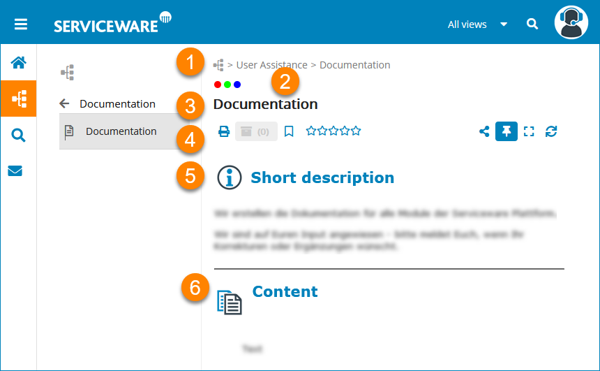
| (1) | Path | (2) | Display of the views in which the content is available |
| (3) | Content title | (4) | Action bar |
| (5) | Short description and full text of the article with illustrations and file attachments | (6) | Footer with further information on the text |
The page header with the path, views, title and action bar can be attached to the page position or to the content via the Pin icon in the action bar and thus made scrollable.
The action bar provides the user with changing options depending on the view, role and selected page.
 |
Attachments | The text contains further information in file attachments. The number of attachments is displayed next to the paper clip icon. |
 |
||
 |
Archived versions | View previous versions of the text. |
 |
Save Bookmarks | Saved bookmarks may be opened via the start page. |
 |
Rating | Rate the page content on a scale from 1 to 5. |
 |
Share | Copy the content to the clipboard, send an email or send a comment on the text. |
  |
Maximize/minimize window area | Maximize the window area beyond the navigation menu or restore its original size. You also have the option to move the window boundary between the content area and navigation area manually using the mouse. |
 |
Refresh | |
  |
Attach/release page header to/from text | Fix path, views, titles and action bar to the text when scrolling and scroll with the text or release and keep position. |
  |
Open/close foldouts together | Open all foldouts in the text or close all elements at once. |
If the text contains illustrations, you can enlarge them by selecting them using the mouse or double-clicking them.
To better display longer texts, you can collapse the footer using the arrow to the right of the information. The default is expanded. If the footer is collapsed or expanded, the system saves this setting. This is also taken into account when calling up other texts via the search or the tree.
