Layouts
You can use layouts to design your Serviceware Knowledge.
Tip: To edit layouts you must be an administration member.
Layouts that are pre-installed in the system cannot be deleted, but you can create as many additional layouts as you want. Layouts are displayed via the assignment to Views.
Layout edit
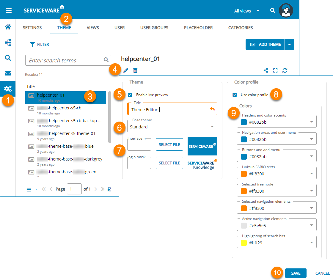
Edit an existing layout as follows:
- Open via the navigation menu.
- Select a layout to be edited from the list.
- In the action bar, select Edit.
- If desired, activate the live preview to check the result of your parameters directly.
- Select a basis layout from the drop-down list.
- Via Select file, choose a logo for the user interface and one for the login page.
-
Choose whether you want to design a color profile or edit the existing one; select User color profile.
- Define the colors for each element of your screen within the dialog. The colors may be selected using a slider or specified as HEX, RGB and HSV values.
- Confirm your color selection by selecting OK.
- Carry out steps 8 and 9 for all screen elements.
- Save your layout parameters.
Creating a layout
- Open via the navigation menu.
- Select Add layout via the Add menu.
- Give your layout a Title.
- Follow steps 5 to 10 from the Customize layout section.
- If desired, activate the live preview to check the result of your settings directly.
- Select a basis layout from the drop-down list.
- Via Select file, choose a logo for the user interface and one for the login page.
-
Choose whether you want to design a color profile or use the existing User color profile.
- Define the colors for each element of your screen within the dialog. The colors may be selected using a slider or specified as HEX, RGB and HSV values.
- Confirm your color selection by selecting OK.
- Carry out steps 8 and 9 for all screen elements.
- Save your layout parameters.
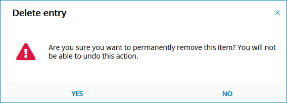
Layout delete
Delete an existing layout as follows:
- Open via the navigation menu.
- Select a layout to be edited from the list.
- In the action bar, select Delete.
-
Confirm the deletion in the dialog.
Layout in the Knowledge-Integrator
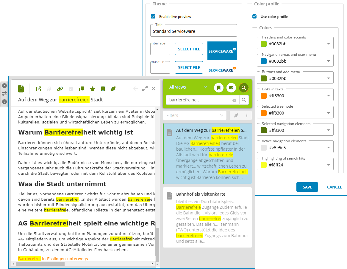
The following color settings are applied:
- Headers and color accents color the background of the navigation in Knowledge-Integrator.
- Buttons and add menu color toolbar icons and icons of navigation elements that have not yet been selected in Knowledge-Integrator,
- Selected navigation elements color the circles of selected navigation elements in the Knowledge-Integrator.
The color settings of the following elements are not applied:
- Highlighting of search hits,
- Active navigation elements,
- Navigation areas and user menu,
- Links in texts,
- Selected branch.
Attention: Do not color any elements white, as this may result in invisible controls.